




























































Julia's Print Clinic | Episode 5
Vector vs Raster: Which File Type Do You Need?
Logos should stay sharp. Photographs should keep their detail. Cut paths must remain usable. Julia explains how vector and raster artwork work together in professional print.
The Practical Guide
Choose the Artwork Type the Job Actually Needs
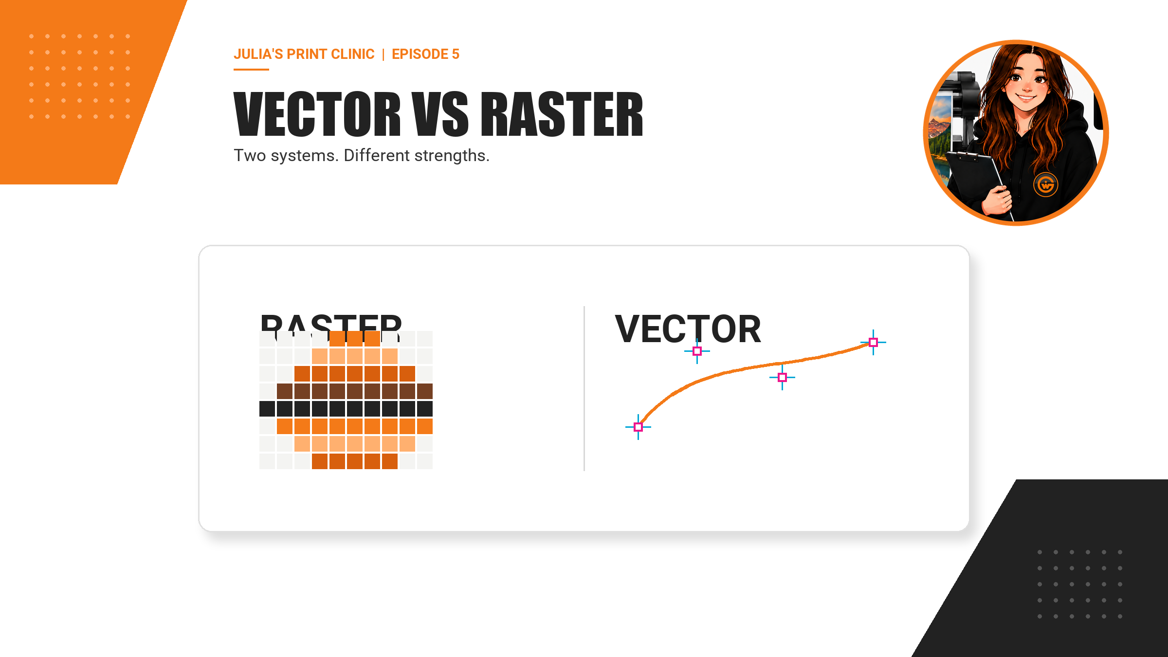
Vector and raster are not rival file formats where one is always better. They are two different ways of building images, and most professional print artwork uses each where it is strongest.
A photograph needs the tonal detail of pixels. A logo, line of type or contour cut path usually benefits from clean vector paths. A print-ready PDF can contain both at the same time. The aim is not to force everything into one format; it is to preserve the right kind of information for every object in the design.
That distinction matters when artwork moves from a screen to banners, boards, stickers, roller banners, flags, tablecloths, SEG displays and other large-format products. A small logo copied from a website may look acceptable in an email but break apart when enlarged. A vector logo may scale cleanly, while a photograph still needs enough pixels for its final size and normal viewing distance.
The file extension is only the start of the check. An AI, EPS, SVG or PDF can contain placed raster images, and a PDF created from a flattened bitmap can be entirely raster. Open the supplied artwork, inspect it properly and use the template for the exact product, size and finish.
Meet Julia
Your Artwork Advice Expert
When I check a file, I do not ask whether the whole document is vector or raster. I look at the objects inside it. Is the logo still a clean path? Is the photograph large enough at the final print size? Is the cutline selectable and on the correct production layer? Those answers are far more useful than the filename alone.
Good artwork can be mixed artwork. The important thing is that every element keeps the properties the production workflow needs.
“A PDF is a container. The objects inside it decide whether your logo stays sharp, your photo keeps its detail and your finishing lines remain usable.”
Raster Explained
Raster Images Are Built from Pixels
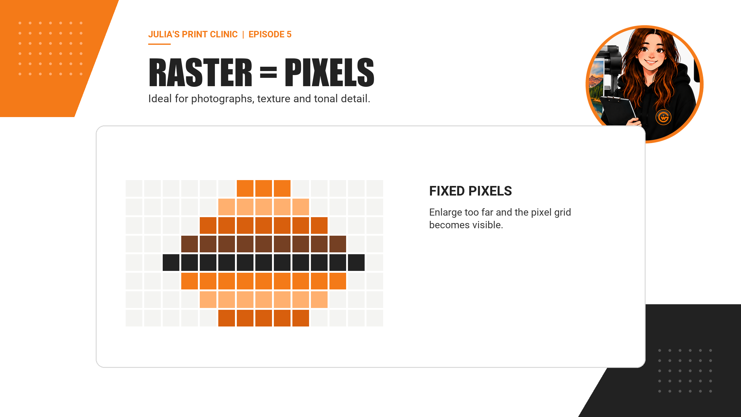
Raster images use a fixed grid of coloured pixels. Photographs, screenshots, scans and most images downloaded from websites are raster. Common raster formats include JPEG, PNG, TIFF and many Photoshop documents.
Pixels are excellent at describing continuous tone, texture, lighting, shadows and the millions of colour changes found in photography. Their limitation is that the pixel count is finite. Ask the same pixels to cover a larger physical area and the effective pixels per inch falls. Enlarge too far and edges soften or individual pixels become visible.
That does not make raster artwork unsuitable for large-format print. Photographs are routinely printed at large sizes. Suitability depends on the source pixel dimensions, the final printed size, the content, the material, the production method and the normal viewing distance. Judge the placed image in the actual product template rather than relying on a resolution label in isolation.
Saving a small JPEG as a PDF does not create new detail. Changing the filename or increasing the PPI number without meaningful resampling does not recreate information that was absent from the source. Start with the best original photograph available.
Vector Explained
Vector Artwork Is Built from Paths and Shapes
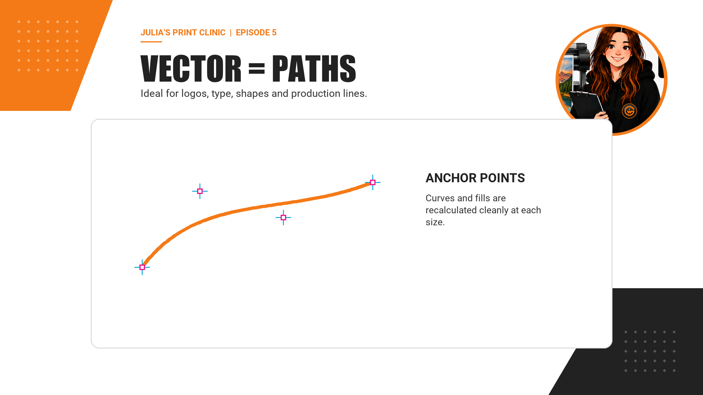
Vector artwork describes shapes using points, lines, curves, fills and strokes. Because those instructions can be recalculated at a new size, a true vector object can normally be enlarged without developing visible pixels. That makes vector artwork especially useful for logos, icons, type, flat illustrations, diagrams and production paths.
Common vector-capable formats include AI, EPS, SVG and PDF. The important word is capable. These formats can also hold or reference raster images. A placed photograph inside an Illustrator file remains a photograph; the AI extension does not turn its pixels into vectors.
Vector artwork is not automatically perfect either. Very thin strokes, clipping masks, transparency, unsupported effects, missing fonts and incorrectly prepared spot-colour paths can still cause production problems. Keep an editable master, export with the appropriate settings and inspect the final PDF rather than assuming the source application has protected everything.
For customer-supplied logos, the original brand artwork is usually better than a logo lifted from a website, email signature or screenshot. Ask the brand owner, designer or agency for the original vector version before attempting a workaround.
Logos and Type
Why Vector Artwork Earns Its Place in Large Format
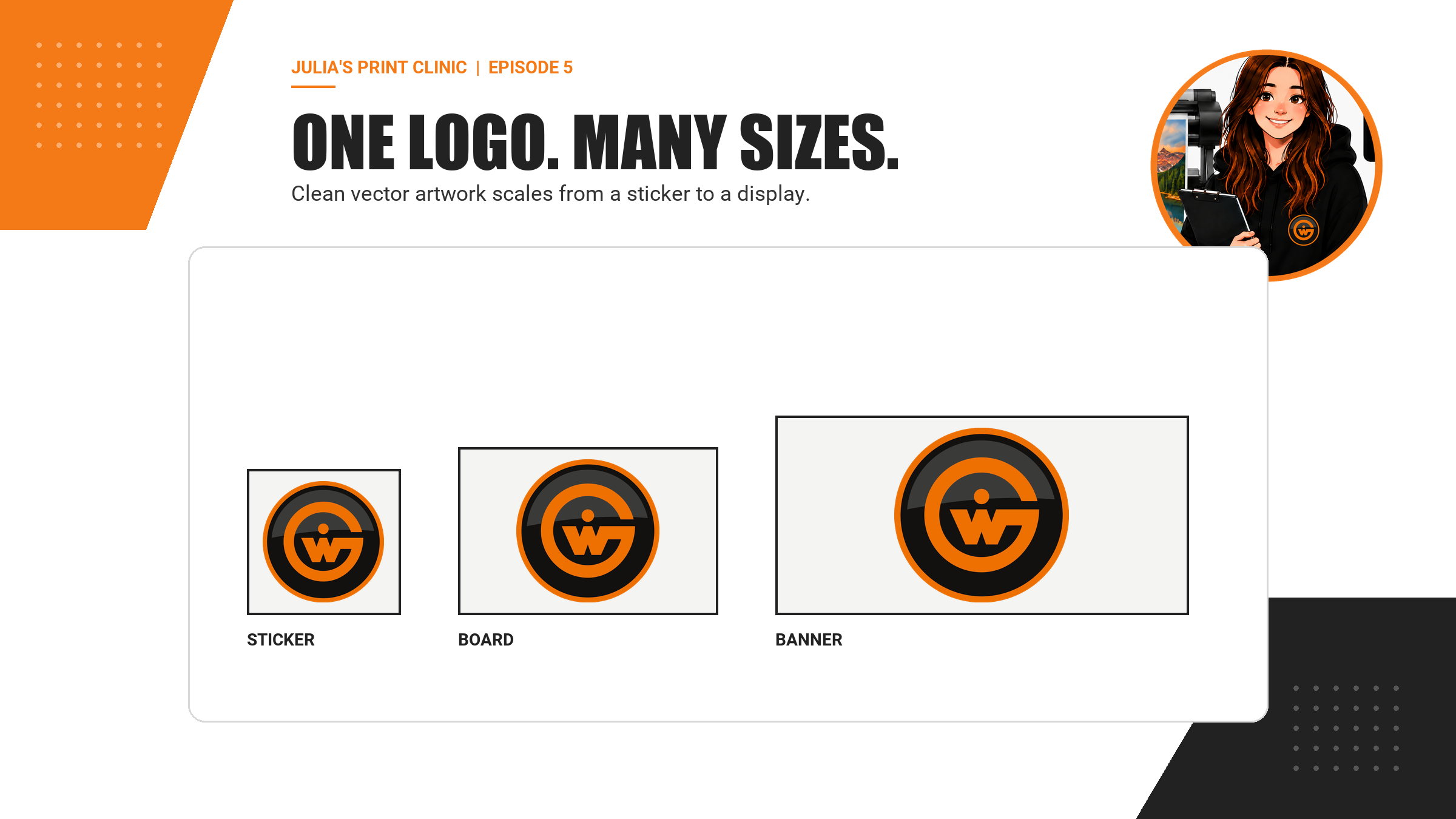
A logo may appear on a small sticker today and a building graphic tomorrow. Keeping the master logo as vector artwork gives the production team clean edges at each size and makes colour, stroke and shape checks more reliable.
The same principle applies to headlines, simple icons, borders and geometric brand elements. If they begin as vectors, avoid flattening them into a small bitmap before export. A PDF can preserve vector type and shapes alongside photographic raster images, giving each element the appropriate treatment.
Scale still affects design decisions. A hairline that exists mathematically may be too fine to reproduce on a particular material or production method. Small counters in type can close up, and intricate shapes can become impractical for cut vinyl. The artwork can be perfectly vector and still need adjustment for the real product. Use the product template and ask the Graphic Warehouse team when fine detail is critical.
Photography
Do Not Force Photographs to Become Vectors
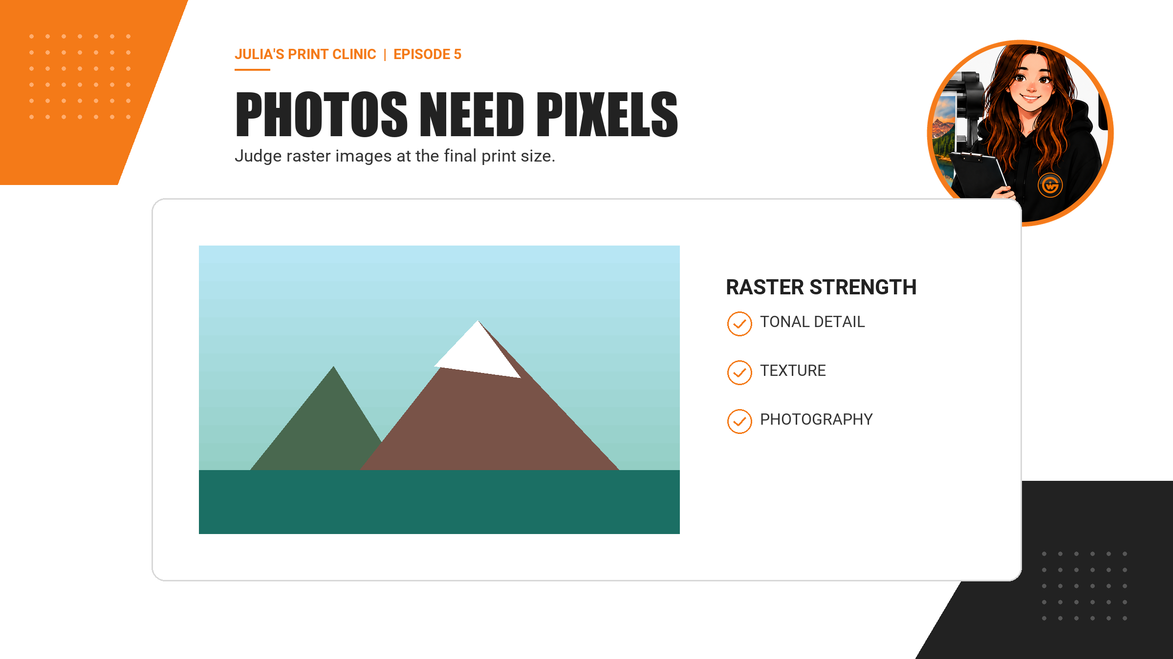
Photography belongs naturally in a raster workflow. A good photograph may contain millions of pixels describing subtle colour, texture and lighting. Converting it into vector paths would either create an extremely complex file or simplify away the detail that makes it photographic.
Use the highest-quality original image you can obtain, place it at the intended size and check its effective resolution. Avoid screenshots, social-media downloads and thumbnails when the original camera file or approved high-resolution image exists.
Compression matters too. JPEG is useful and widely supported, but repeated saving can introduce visible blocks, ringing around edges and loss of fine detail. PNG can preserve sharp flat graphics without lossy JPEG compression, but it is still raster and still has finite dimensions. TIFF and PSD can retain more editing information, although the final supplied format must suit the ordering workflow.
A product photograph, face, texture or detailed scene may print beautifully as raster artwork. The question is whether the pixels are appropriate for the final product and viewing conditions, not whether the image can be forced into a vector extension.
Production Paths
Cutlines, Creases and Drill Marks Need Usable Geometry
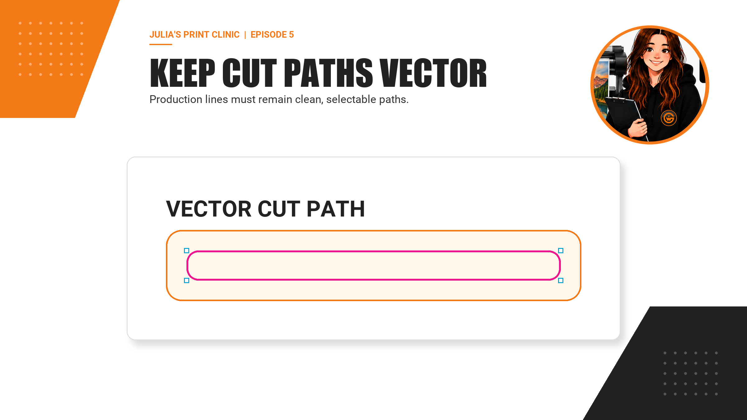
Printed stickers, shaped boards, contour-cut graphics and other finished products may need production paths in addition to the visible design. These lines are instructions for equipment and workflow, so they must remain clean, selectable vector paths prepared according to the product template.
A magenta line visible in a JPEG is only a row of coloured pixels. It may look like a cutline to a person, but it does not provide the vector geometry a finishing workflow expects. The same warning applies when a cut path has been flattened into a photograph or merged into a raster preview.
Use the exact naming, spot-colour, stroke and layer conventions stated by the relevant product template or artwork guidance. Requirements can vary by product and workflow. Do not copy a finishing setup from an unrelated item and assume it will behave the same way.
Keep important text, logos and live imagery safely away from finishing paths. Vector geometry helps production follow the intended shape, but it does not replace correct bleed, safe zones, trim allowances or a careful approval preview.
The PDF Question
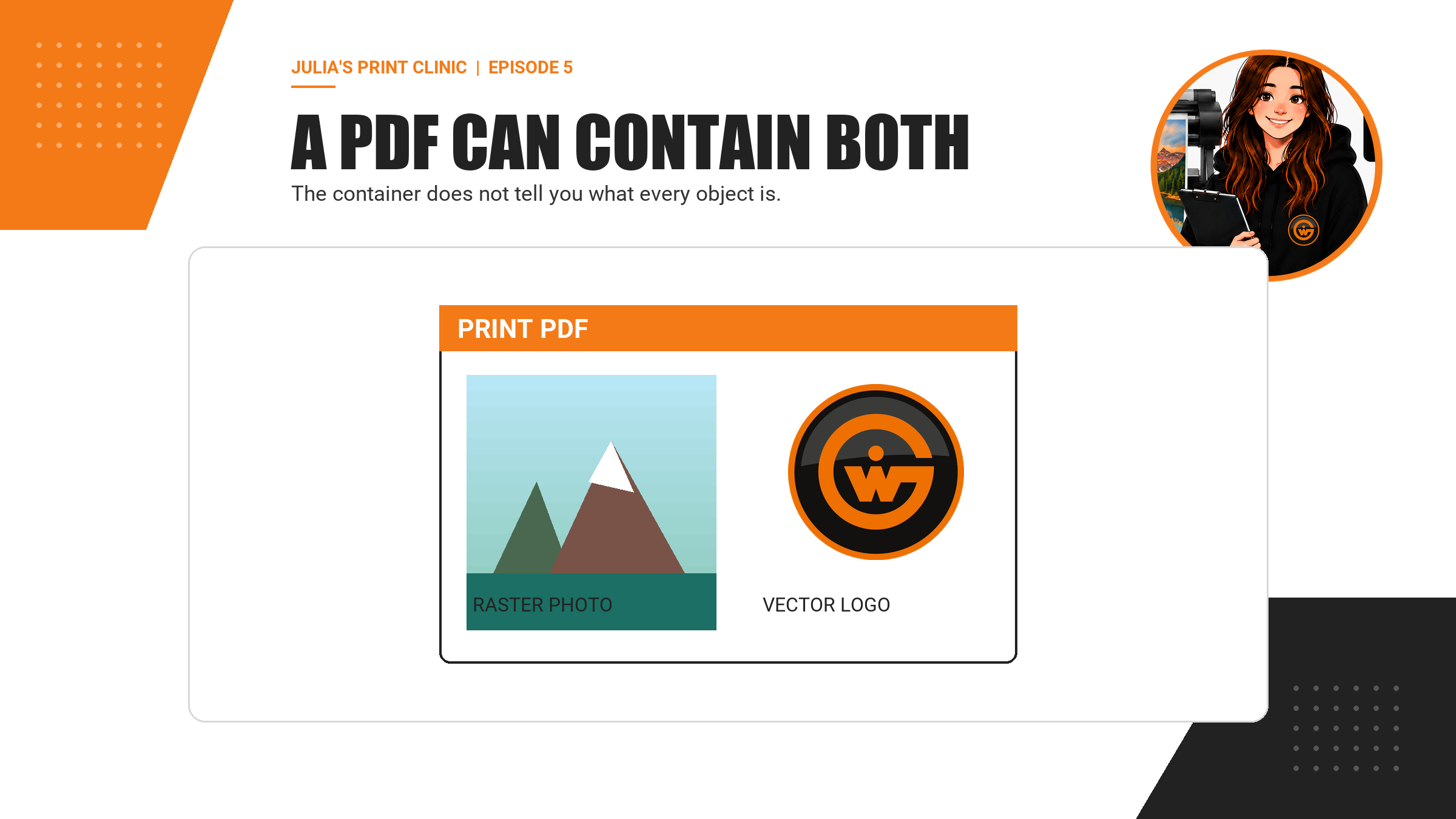
A PDF Can Be Vector, Raster or a Mixture
PDF is often an excellent delivery format for print because it can preserve page size, vector paths, text, colour information and placed raster images in one document. But PDF describes the container, not a guarantee about every object inside it.
A PDF exported from Illustrator or InDesign may contain clean vector logos and type together with high-resolution photographs. A PDF created from a flattened JPEG may contain only pixels. A PDF can also include low-resolution placed images, transparency, clipping paths, spot colours or fonts that need checking.
Inspect the final PDF at useful zoom. Vector edges should remain clean as you zoom in, while raster photographs will eventually reveal their pixel structure. In Acrobat Pro, Print Production and Output Preview tools can help inspect object information, separations, overprint behaviour and other production details. The most reliable final check remains the correct product template plus the supplied artwork preview and preflight workflow.
Do not judge suitability by file size alone. A large PDF can contain unnecessary data, while a compact PDF can contain efficient vector artwork. Look at what is inside and whether it is appropriate for the ordered product.
Look Inside
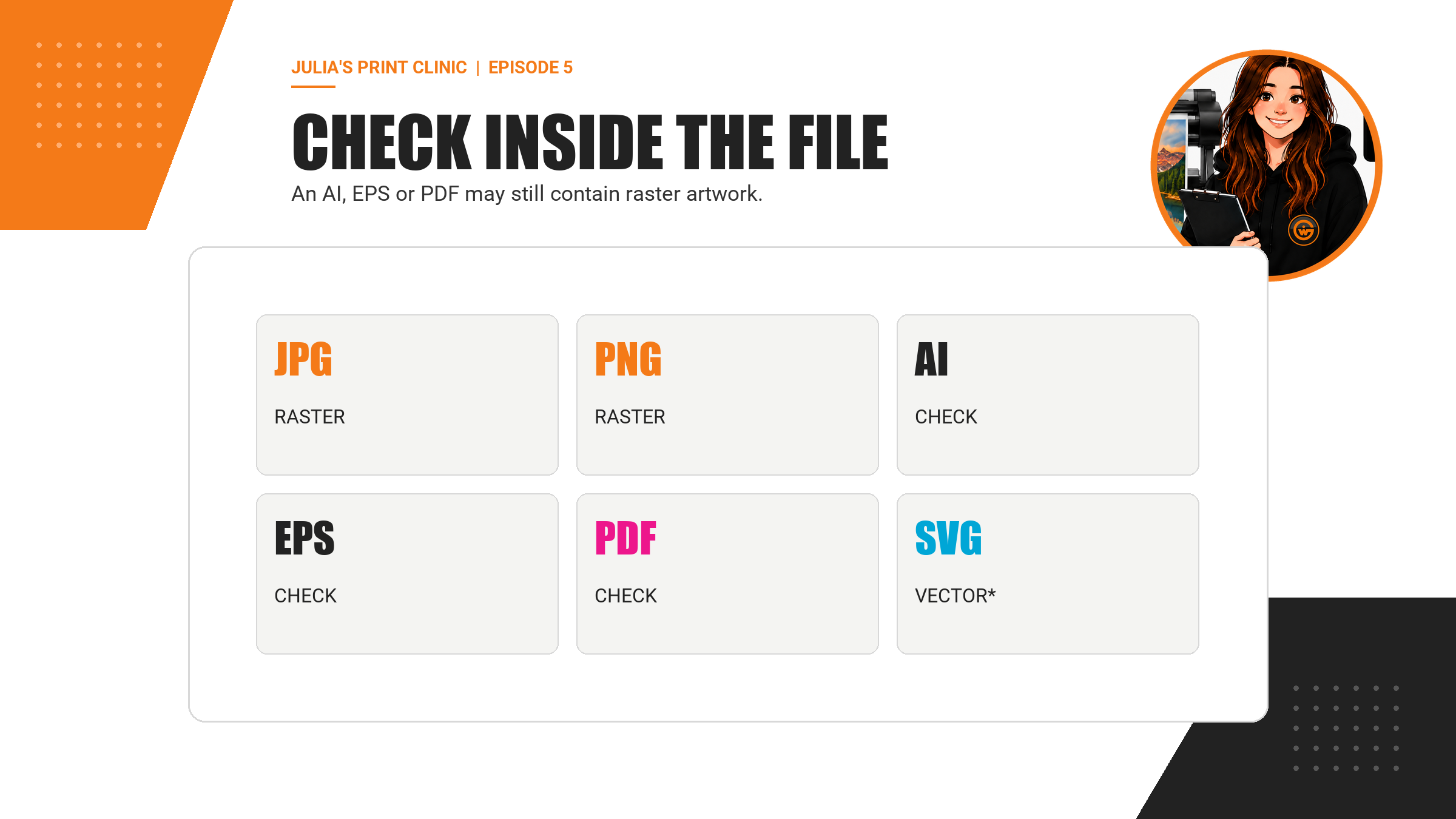
The Extension Does Not Prove the Contents
JPEG and PNG are raster formats. AI, EPS, SVG and PDF are commonly associated with vector artwork, but that does not mean every object they contain is vector or production-ready. An EPS can include a raster preview or image. An Illustrator file can include linked photographs. An SVG can contain embedded raster data. A PDF can contain almost any mixture.
Renaming logo.jpg to logo.pdf does not convert the logo. Placing it in Illustrator and saving an AI file does not convert it. Embedding the JPEG packages the pixels inside the document; it does not replace them with mathematical curves.
Zooming in is a useful first clue, but it is not a complete preflight. Some effects are rasterised at export, and some vector objects may be clipped or hidden. Check links, fonts, layers, page size, colour setup and the final preview as well as edge sharpness.
When you are unsure, send the best original source file and explain what it is meant to do. Knowing that an object is a logo, photograph, white-ink layer or cut path helps the production team assess it in the right context.
Links and Fonts
Keep the File Complete When It Leaves Your Computer
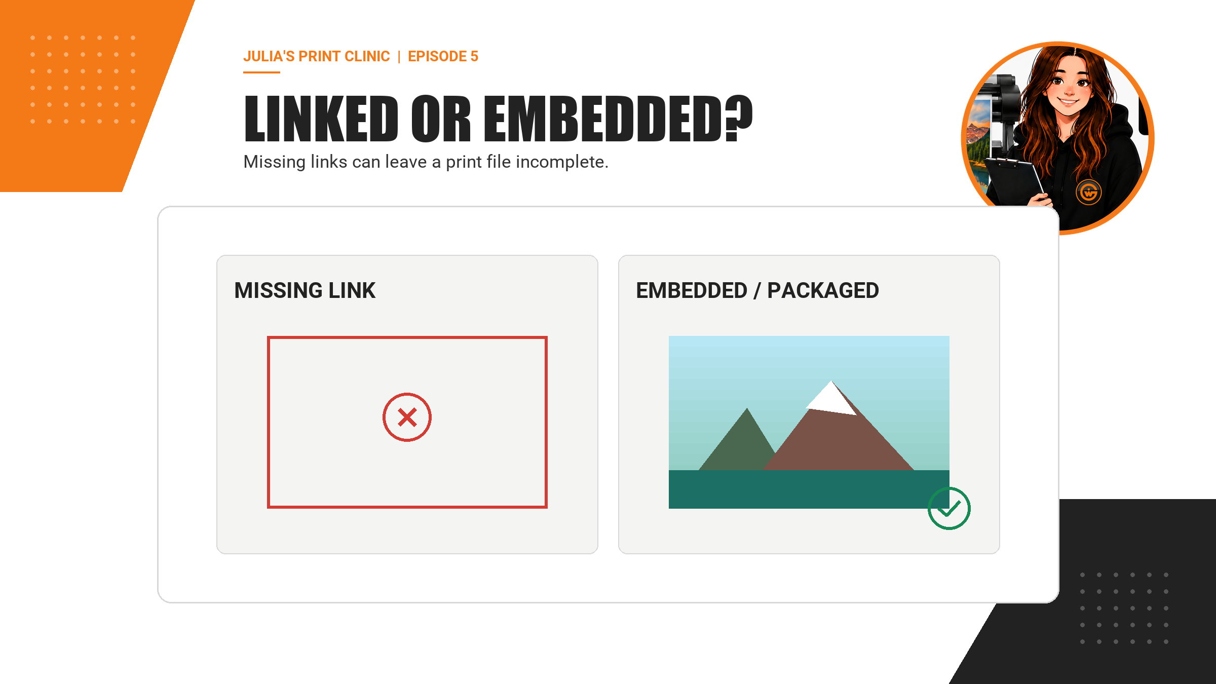
Layout and illustration applications can link to external photographs rather than storing every pixel inside the working file. That keeps the source document manageable, but a link that only exists on your computer can be missing when the artwork is opened elsewhere.
Embed placed images where the workflow allows, package the document with its links, or export a self-contained print PDF using the agreed settings. Then reopen the exported file and confirm that every photograph and graphic appears at full quality.
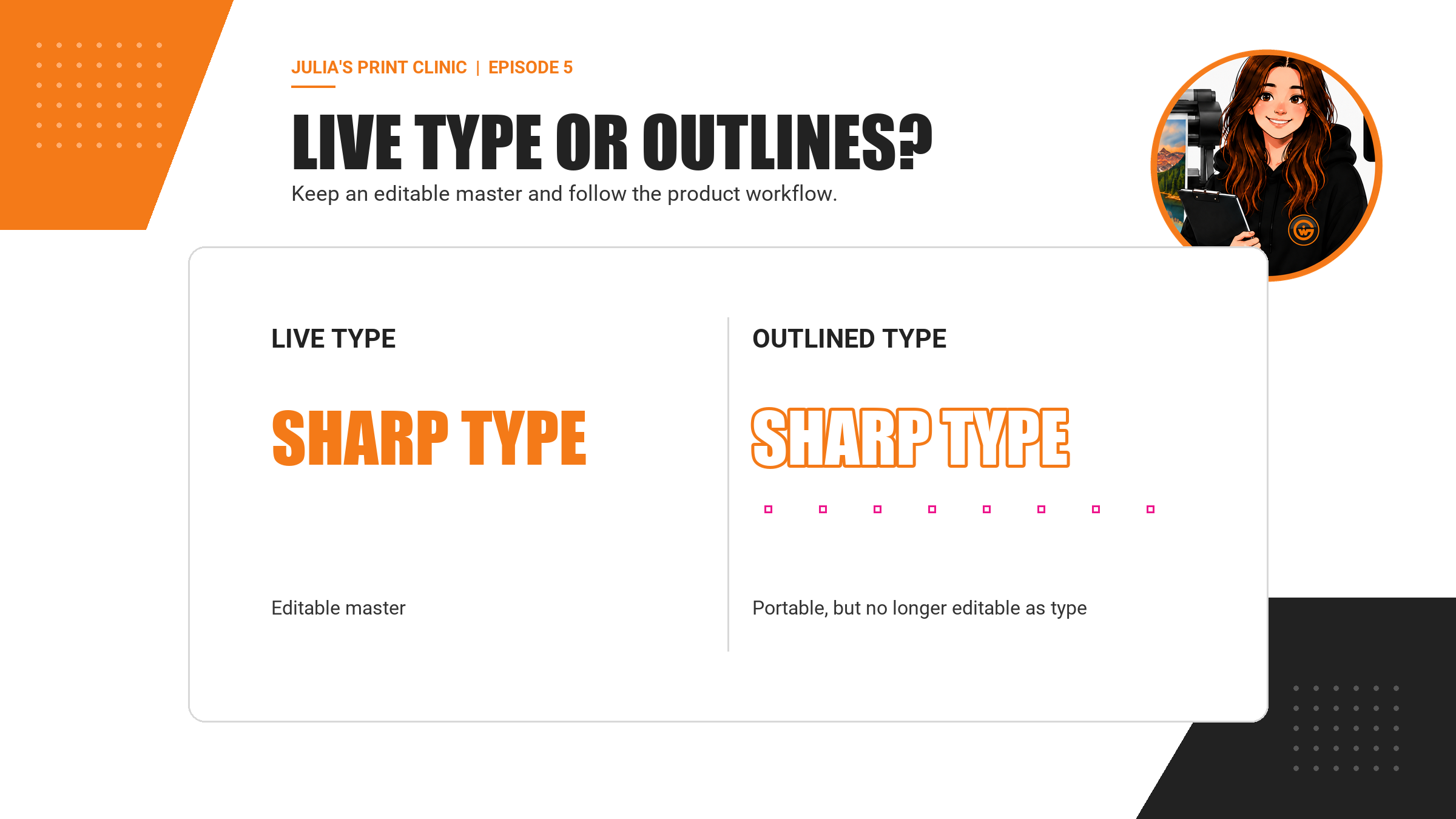
Fonts need similar care. A live text object depends on the typeface being available or embedded correctly. Converting text to outlines can make letter shapes portable, but it removes normal text editability and can subtly affect very small or fine type. Keep an editable master with live text, and only outline or embed fonts according to the production workflow.
Do not flatten the entire design merely to avoid one missing link or font. That can turn sharp logos, type and finishing paths into pixels. Resolve the missing resource while preserving the useful vector structure.
About Image Trace
Automatic Tracing Is a Tool, Not a Time Machine
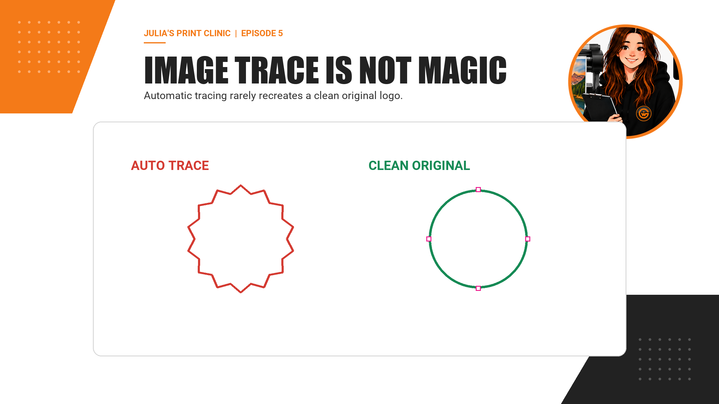
Image tracing can convert areas of a raster image into vector shapes, but the result is an interpretation of the pixels. It does not recover the original curves, typeface, spacing or construction that existed before the artwork was rasterised.
A low-resolution logo can produce too many anchor points, uneven circles, lumpy diagonals and altered letterforms. Those defects may become more obvious when the result is enlarged or cut. Increasing the trace settings can create a heavier and more complicated file without making the brand mark genuinely accurate.
For simple artwork, careful manual redrawing may produce a cleaner result, but brand approval and ownership still matter. The preferred route is to locate the original vector logo from the designer, brand library or customer. Use tracing only when appropriate, compare it against an approved reference and inspect the paths before production.
Never auto-trace a photograph just to satisfy a request for vector artwork. Keep the photo raster, preserve its detail and use vector elements for the parts that actually benefit from paths.
Before You Approve
Julia's Final Vector and Raster Check
Start with the product, size and finishing method. Download or generate the correct product-specific template and build the artwork in that context.
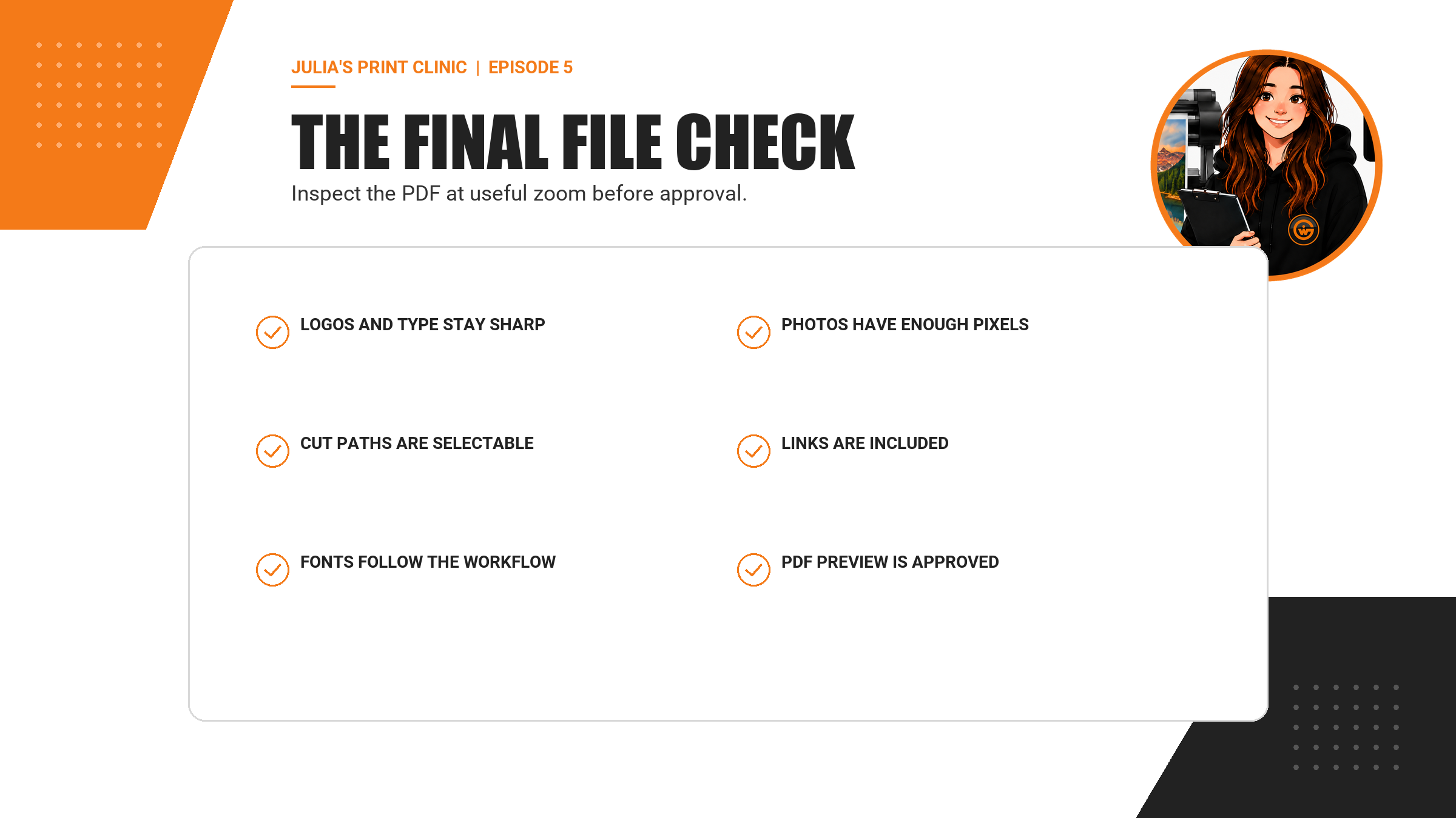
Keep logos, type, icons and production paths as vector objects where practical. Use original high-quality raster files for photography and detailed texture. Confirm that placed images have suitable effective resolution at the final output size.
Check that linked images are embedded or supplied, fonts follow the agreed workflow, and production paths remain selectable and correctly named. Export the requested print file without unnecessarily flattening useful vectors.
Finally, reopen the supplied PDF. Inspect the page size, bleed, safe zones, colour, photographs, logos, text, transparency and finishing layers. Review the upload preview carefully before approval. If any object has an important production role and you are not sure how it should be prepared, ask the Graphic Warehouse team before the job enters production.
- Logos and type remain sharp at useful zoom.
- Photographs have enough pixels at final size.
- Cut paths and finishing marks remain vector and selectable.
- Linked images are embedded or supplied with the job.
- Fonts and transparency follow the agreed export workflow.
- The final PDF and upload preview match the intended product.
Frequently Asked Questions
What is the best file type for a logo?
The original vector logo is usually the best starting point for print because it can scale cleanly. AI, EPS, SVG and suitable PDFs may preserve vector artwork, but inspect the actual contents rather than relying only on the extension.
Is every PDF a vector file?
No. A PDF can contain vector objects, raster images or a mixture of both. A PDF made from a flattened JPEG may be entirely raster.
Can I turn a JPEG into a vector by saving it as a PDF?
No. Changing the container or filename does not convert pixel data into clean vector paths. Obtain the original vector artwork or rebuild it carefully when appropriate.
Are raster images acceptable for professional print?
Yes. Photographs and detailed tonal images are naturally raster. They need suitable pixel dimensions and effective resolution for the final print size, product and viewing distance.
Should I convert every font to outlines?
Not automatically. Outlining can improve portability in some workflows but removes normal text editability. Keep a live-text master and follow the requirements for the exact product and supplied file format.
Do cutlines need to be vector?
Production cut paths should normally remain clean, selectable vector paths prepared with the naming, spot-colour and layer rules in the relevant product template.
Can Graphic Warehouse check my artwork?
Yes. Tell the team the exact product, size and finish, and supply the best original artwork available so it can be assessed in the correct production context.
Need a Hand?
Send the Right Artwork for the Right Product
Choose the product first, use the correct template and preserve the best original artwork. Ask Julia's team before production if you are unsure whether a logo, photograph or finishing path is suitable.
START YOUR PRINT ORDERASK JULIA'S TEAMNext Time in Julia's Print Clinic
Fonts, Outlines and Missing Typefaces
How to keep your artwork looking right when it moves between computers, designers and production systems.
Please login to post a comment.